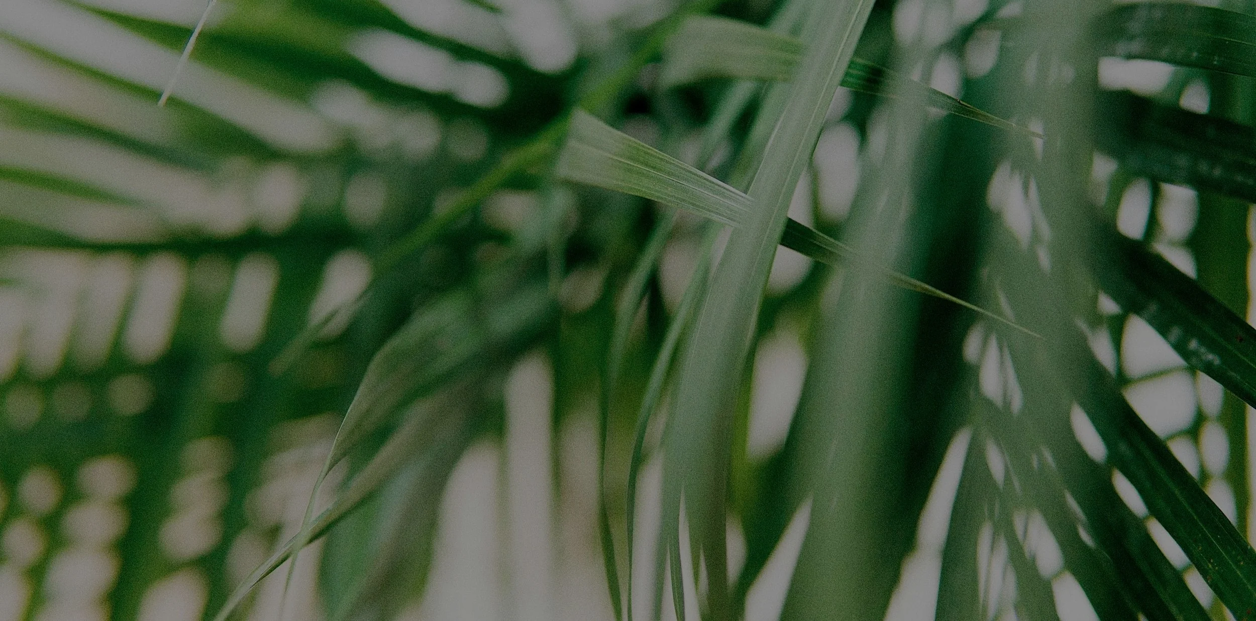

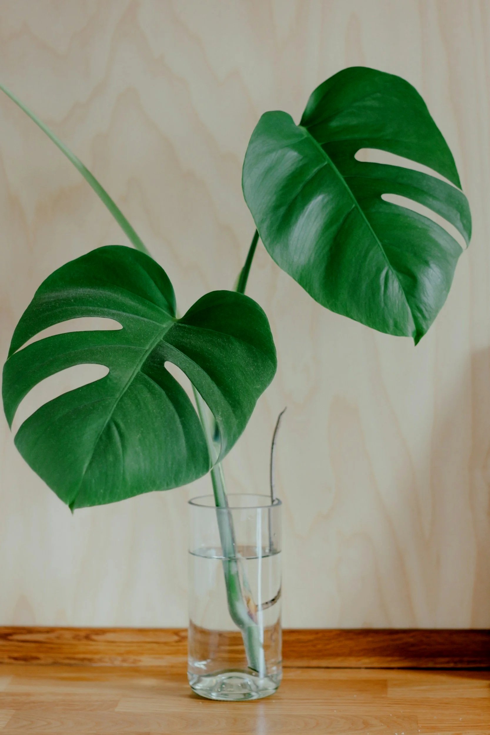
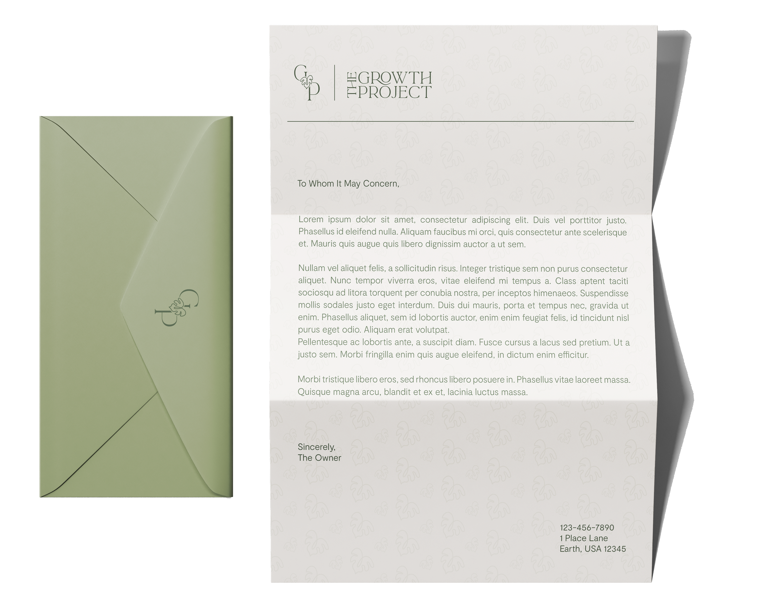
The Growth Project
Branding • Logo Design

The Growth Project offers mental health and wellness services and needed a custom brand to reflect their work. They wanted their logo to show safety, calm, warmth, and the strength of personal growth. Using symbols like the sun and the monstera plant, paired with natural yellows and greens, the brand was born!

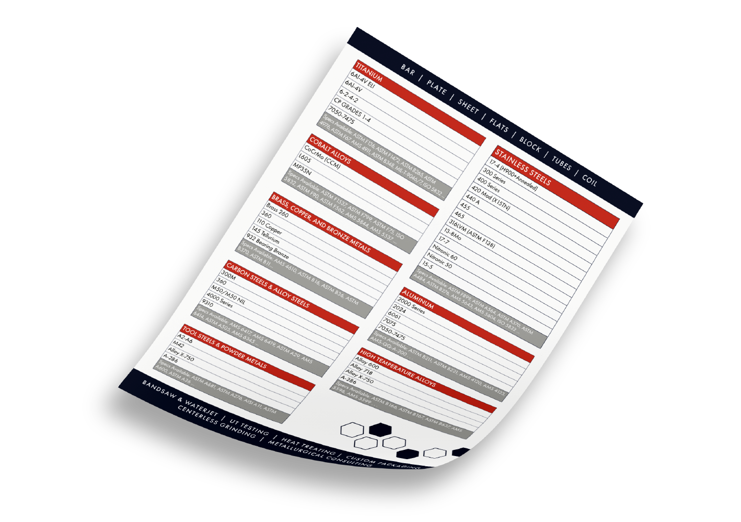
Vested Metals
Typography • Print Design • Layout Design
Vested Metals needed updated brochures and line cards to showcase their services and applications for specialty metals. The task was to create a new look for the printed materials, while staying within their brand guidelines. I decided to use black and white photography of metal bars, paired with their vibrant reds and navy blue colors, to create contrast and make their products stand out against the competition.


BB’s Pet Services
Logo Design • Branding • Illustration
BB’s Pet Services is a pet-sitting company that needed an original logo and branding suite. The owner, who has two pugs named Bentley and Bowie, wanted these dogs uniquely represented in the logo. I designed two small pugs stacked vertically to symbolize their brotherly bond. The baby blue and brown color palette conveys a youthful, playful vibe. Additionally, I created a pattern for use across stationery and created a concept van to help visualize the brand.


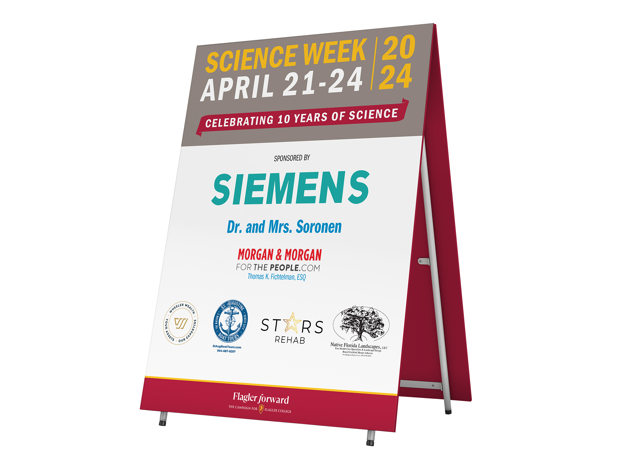
Logo Design • Layout Design • Typography
Flagler College
For this project, Flagler College needed a variety of graphics for their annual Business Week and Science Week events. I was tasked with designing the logo for both weeks, creating web banners, and posts for Instagram, Twitter, and LinkedIn, and curating printed marketing materials for certain events throughout the week. The goal was to remain consistent with the Flagler Forward campaign branding with the content and create a dynamic logo that could be applied to many variations of media.


The Sports Corner
Branding • Typography • Layout Design
For this marketing bi-fold, The Sports Corner wantd to showcase their products and services. I incorporated elements of their branding throughout the brochure as well as their brand colors to maintain consistency with the store. Along the bottom of the inside pages, I placed the logos of their most popular customers to show credibility. To add a creative element, I created a screenprinting squeegee gliding seamlessly from the back page to the front page and used the same design for each header on other pages.

Package Design • Logo Design • Illustration
Moo Milk
Moo Milk is an award-winning package design concept for flavored milk products. The goal was to grab the attention of the consumer through illustration and flavor correlation, as well as unique containers that are different from typical milk carton shapes. I created a “family” of Moo Milk characters that consists of a mother, father, and baby, illustrated with different characteristics and features that correlate to each flavor and color. On the back of the containers, I put a different cow-related joke, called “udderly funny jokes”, to add more character to each bottle!


Hibiscus Brewery
Logo Design • Package Design • Illustration

Hibiscus Brewery is a conceptual package design for naturally flavored tequila seltzers. The designs reflect a tropical and outgoing lifestyle and are meant to be vibrant and eye-catching, similar to the characteristics of the hibiscus flower. Through the use of correlating colors, patterns, and illustrations, each flavor of the drinks contrasts with the base flavor of hibiscus and stands out on shelves to consumers walking through an aisle of endless options!


Package Design • Logo Design • Illustration
Goodies

Goodies is a conceptual line of plant-based dog treats made by Milkbone. There are three flavors: carrot kale, banana peanut butter, and apple pear. The treats are grain-free, vegan, contain low calories, and have no artificial ingredients to support a healthy dog lifestyle. The containers are small enough to carry them on walks, or in your pocket, as they are printed on matchboxes and tin can packaging for access to the treats.


Invictus
App Design • Interactive Design • Branding
Invictus is a conceptual workout app that enhances the user experience through connected devices and accessibility. Invictus allows users to connect their own devices to the app, regardless of the device brand, enabling a more inclusive and accessible experience. This makes the user experience much less expensive than alternative competitors and also allows the consumer to focus on their goals without any financial hindrances. The app has a more feminine aesthetic than most workout apps and is meant to showcase a calm and relaxing environment.


Light & Airy
Book Design • Typography • Illustration
Light & Airy is a Type Specimen Book for Avenir Next Lt Pro, a typeface created by Adrian Frutiger in 2003. This font family is known for its readability, and wide range of styles giving it a more modern Sans look. Avenir means “future” in French, so this Type Specimen Book revolves around light and airy one-line drawings, inspired by the French duo artist group, “Differantly” or “DFT”, to compliment the modern and minimalistic style of Avenir Next.


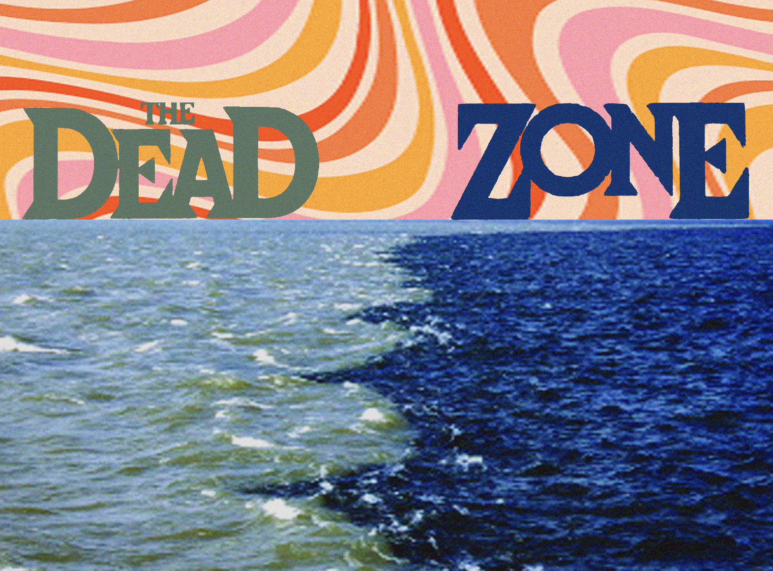
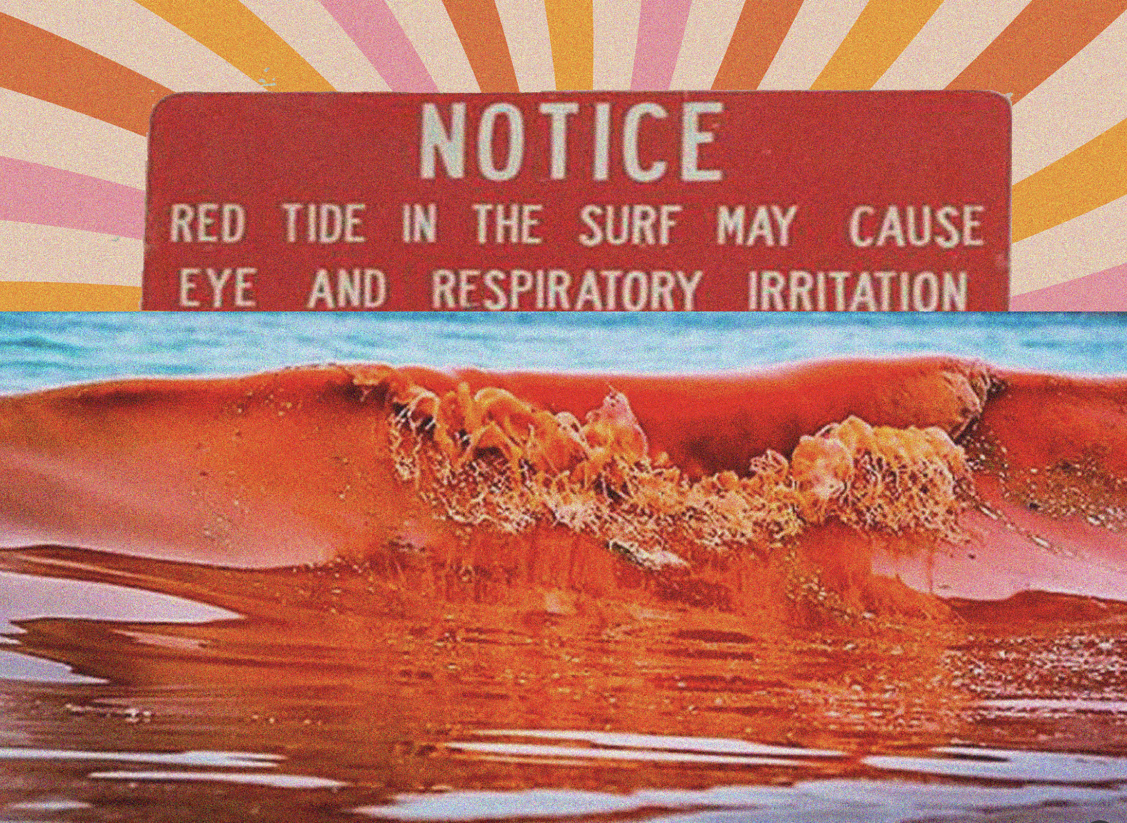
Book Design • Collage Art • Layout Design
Zines
This was a fun project I made for a book arts class I took in college. The goal was to create three zines with anything we wanted, as long as they all followed the same theme/narrative throughout. I created a series of collages using clippings from old sports, surf, and other vintage magazines. The zines show a variety of ways that we have impacted the ocean. There is a dark juxtaposition of environmental impacts and other moral questions of these times through pop culture, the media, and society . Somewhat of a “It’s all fun and games…” narrative throughout the pages.